Search box customization with TypeScript
Overview
This section describes how to develop the Search box customization previously introduced using the Dialog component of Kintone UI Component with TypeScript.
Components to use
Completed image
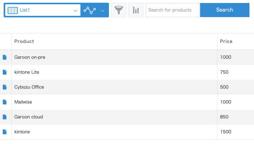
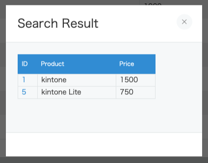
The complete image of the search box and the search result dialog is as follows:
Search box

Search result dialog

Build and implement a TypeScript development environment
For instructions on how to set up a TypeScript development environment, check Usage with TypeScript.
Display of the search box
Use the Text and Button components to display the search box.
Import each component and the type definition information for each component.
import { Button, Text, TextProps, ButtonProps } from "kintone-ui-component";
Use each component's type definition information for each component's variables.
const header = kintone.app.getHeaderMenuSpaceElement();
if (!header) return;

// Prevent duplication bug with ID granted by property
if (document.getElementById('kuc-searchbox-text') !== null) {
  return;
}

const textProps: TextProps = {
  id: 'kuc-searchbox-text',
  placeholder: 'Search for products'
};

const buttonProps: ButtonProps = {
  text: 'Search',
  id: 'kuc-searchbox-button',
  type: 'submit'
};

const text = new Text(textProps);
const button = new Button(buttonProps);
header.appendChild(text);
header.appendChild(button);
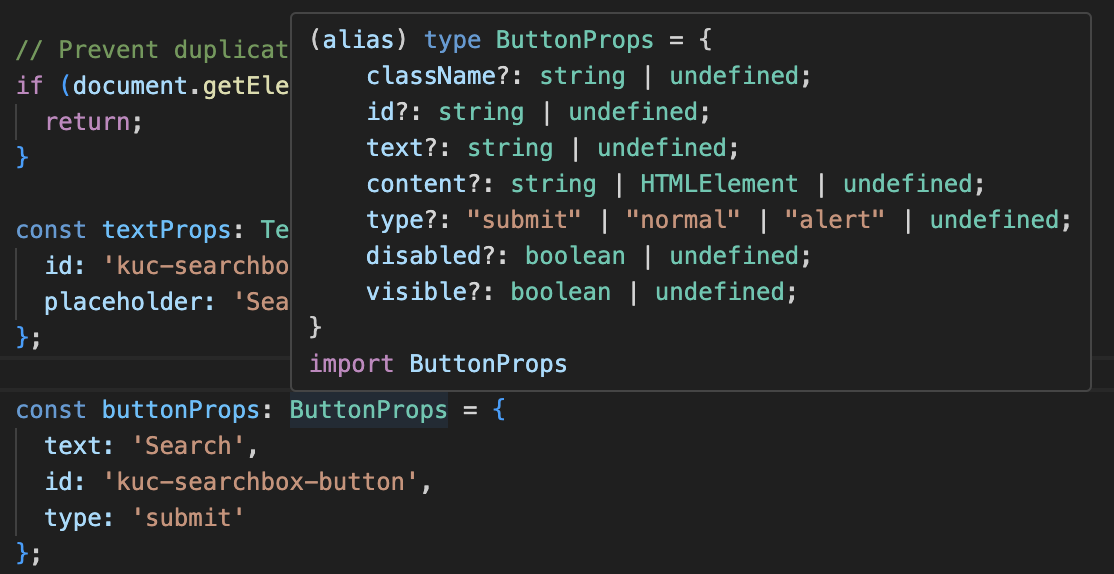
Hover and mouse over ButtonProps or TextProps to see their properties.

Display of the search result dialog
In the previous method of creating a search box, a query string is embedded in the URL of the Kintone app's filter function in order to display search results.
The specific part is '&q=f6054049%20like%20"' in the following code.
Since this is not a recommended implementation method, we will use the Dialog and ReadOnlyTable component to display the search results.
kintone
  .api(kintone.api.url('/k/v1/records', true), 'GET', params)
  .then(resp => {
    if (resp.records.length !== 0) {
      // Process of displaying record retrieval result
      const url = '?view=' + id + '&q=f6054049%20like%20"' + keyword + '"';
      window.location.replace(url);
    }
First, import the Dialog component and type definition information.
In this implementation, various processes are executed in main.ts, which fires the event processing of Kintone.
The search result dialog is displayed in the createDialogWithTable.ts file.
The type definition information of the Dialog component is used for the variables of the Dialog component.
import { Dialog, DialogProps, ReadOnlyTable } from 'kintone-ui-component';

export const createDialogWithTable = (resultTable: ReadOnlyTable) => {
  const dialogProps: DialogProps = {
    title: 'Search Result',
    content: resultTable
  };
  const result = new Dialog(dialogProps);
  result.open();
};
The resultTable is the result of executing the Kintone REST API Client in the api.ts file, processed in the main.ts file, and passed to the createReadOnlyTable.ts file.
export const getAllRecords = (keyword: string, appId: number) => {
  const client = new KintoneRestAPIClient();
  const body = {
    app: appId,
    condition: `product like "${keyword}" or price like "${keyword}"`
  };
  return client.record.getAllRecords<MyAppRecord>(body);
};
// API request
const apiResult = await getAllRecords(keyword, appId);

// Pick up the necessary information from the API result
const records = apiResult.map(record => {
  return {
    // url creation
    $id: `<a href=/k/${appId}/show#record=${record.$id.value}>${record.$id.value}</a>`,
    product: record.product.value,
    price: record.price.value
  };
});
export const createReadOnlyTable = (records: Record[]) => {
  const initialTableData: ReadOnlyTableProps = {
    columns: [
      {
        title: 'ID',
        field: '$id'
      },
      {
        title: 'Product',
        field: 'product'
      },
      {
        title: 'Price',
        field: 'price'
      }
    ],
    data: records,
    id: 'kuc-searchbox-readonly-table',
    visible: true,
    pagination: true,
    rowsPerPage: 5
  };

  const table = new ReadOnlyTable(initialTableData);
  return table;
};
Adjust the style of the search box and search result dialog
Kintone UI Component has provided Custom CSS functionality. By specifying the Custom CSS properties of each component, you can safely change the width and height of components without DOM manipulation.
In this article, we will adjust the CSS of the Dialog and Text components.
#kuc-searchbox-readonly-table {
  --kuc-readonly-table-header-0-width: 40px;
  --kuc-readonly-table-header-1-width: 160px;
  --kuc-readonly-table-header-2-width: 80px;
}

#kuc-searchbox-text {
  --kuc-text-input-height: 48px;
}
Conclusion
How is it working out for you? This section explains how to develop with TypeScript, Dialog component, and Custom CSS of the Kintone UI Component.
We hope you can utilize this article.
This article was reviewed by Kintone and Google Chrome as of February, 2024.
In addition, the version of Kintone UI Component that is used for customization is v1.16.0.