Format setting plug-in
概要
kintone のアプリ画面だけでなく、プラグインの設定画面でも kintone UI Component を使うことで活用の幅を広げることができます。
今回は簡易的な条件書式プラグインの作成を例に、プラグイン設定画面での kintone UI Component の使い方を説明します。
使用するコンポーネント
完成イメージ
以下が、実装シナリオと画面の完成イメージです。
会社の決算日をプラグイン設定画面で設定し、本日の日付が決算日以前のレコードの特定フィールドを赤くするカスタマイズをプラグイン化します。
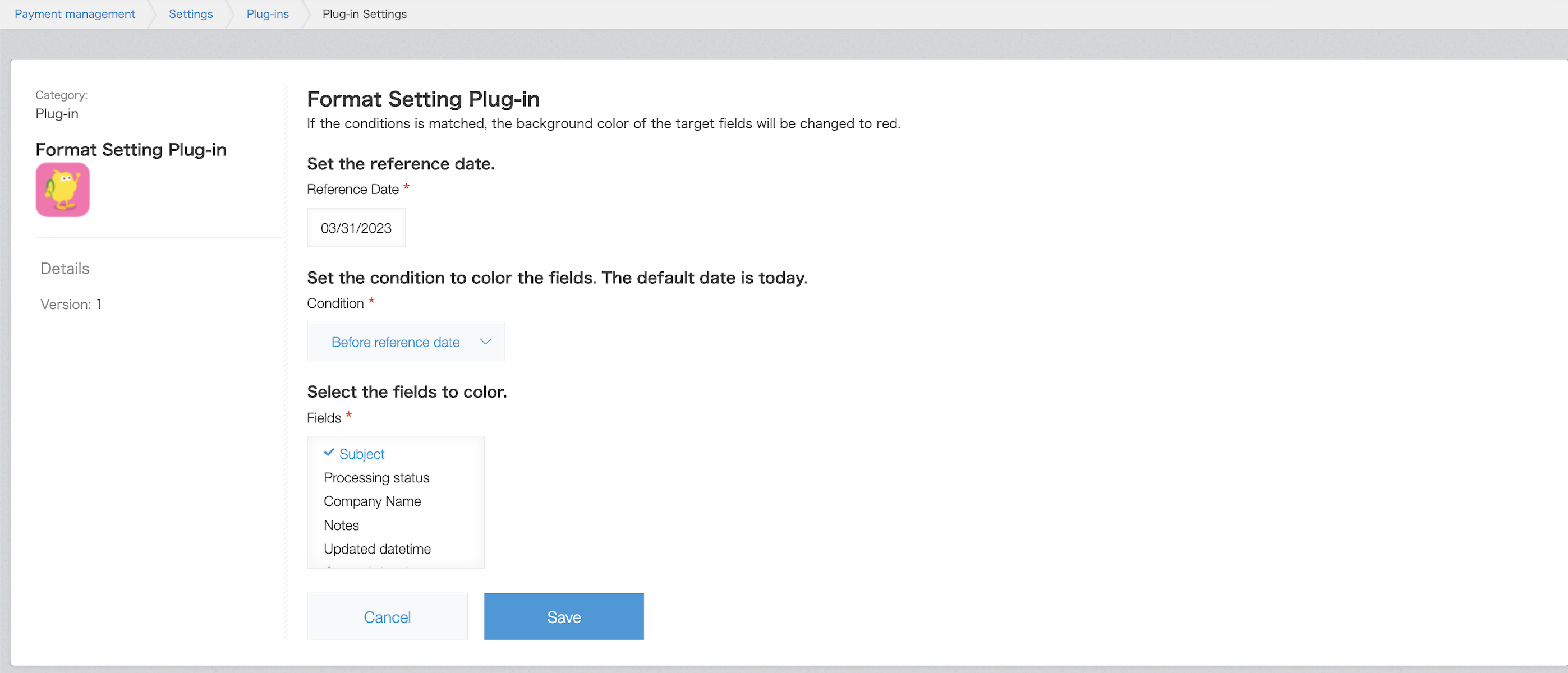 プラグイン設定画面です。
設定した条件(本日の日付が基準日付より前、または基準日付より後)を満たすと、設定したフィールドの色がレコード詳細画面で赤色に変わります。
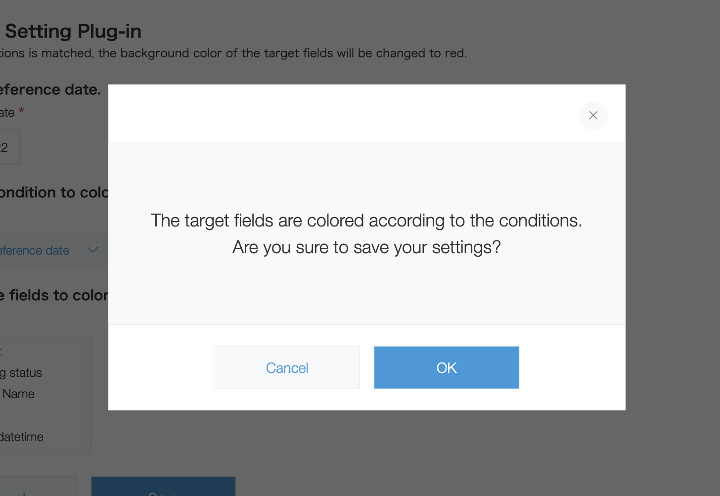 設定を保存する際に、確認ダイアログを表示します。
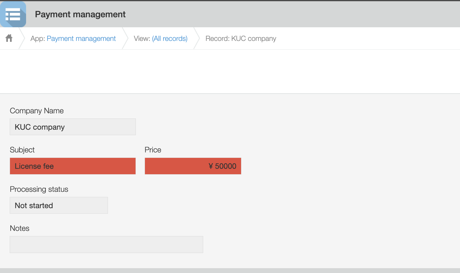 入金を管理するアプリです。
プラグイン設定画面で設定した条件に応じてフィールドの背景色が変わります。
事前準備
kintone プラグインの作成にあたり、今回は以下のフォルダ構成で、ファイルを用意します。
フォルダ構成、ファイル名などは一例です。
src/
├── image/
|   ├── icon.png
├── js/
|   ├── config.js
|   ├── desktop.js
├── css/
|   ├── config.css
├── html/
|   ├── config.html
├── lib/
|   ├── luxon.js
|   ├── kuc.min.js
|
├── manifest.json
マニフェストファイルの作成
以下のようなマニフェストファイルを作成します。
{
  "manifest_version": 1,
  "version": 1,
  "type": "APP",
  "name": {
    "en": "Format Setting Plug-in"
  },
  "description": {
    "en": "This is a sample plug-in."
  },
  "icon": "image/icon.png",
  "desktop": {
    "js": [
      "js/desktop.js",
      "lib/luxon.js"
    ],
    "css": []
  },
  "config": {
    "html": "html/config.html",
    "js": [
      "lib/kuc.min.js",
      "js/config.js"
    ],
    "css": [
      "css/config.css"
    ],
    "required_params": ["date", "condition", "targetFields"]
  }
}
今回はプラグイン設定画面のカスタマイズで kintone UI Component を使用するので、config オブジェクトの中に UMD ファイルのパスを記載します。
UMD ファイルの導入方法は、Quick Start をご覧ください。
プラグインアイコンの作成
こちらのガイド記事に沿ってプラグインのアイコンを作成します。
アイコンファイル(icon.png)を image フォルダに配置します。
HTMLカスタマイズ
プラグイン設定画面用の HTML ファイルを作成します。
今回は以下のように作成します。div 要素に設定した id を利用して、kintone UI Component の各パーツを配置していきます。
<section class="settings">
  <h2 class="settings-heading">Format Setting Plug-in</h2>
  <p>If the conditions match, the background color of the target fields will be changed to red.</p>
  <br/>
    <h3 class="kintoneplugin-desc">Set the reference date.</h3>
    <p class="kintoneplugin-row">
      <div id="date_space"></div>
    </p>
    <br/>
    <h3 class="kintoneplugin-desc">Set the condition to color the fields. The default date is today.</h3>
    <p class="kintoneplugin-row">
      <div id="dropdown_space"></div>
    </p>
    <br/>
    <h3 class="kintoneplugin-desc">Select the fields to color.</h3>
    <p class="kintoneplugin-row">
      <div id="multichoice_space"></div>
    </p>
    <br/>
    <p class="kintoneplugin-row">
      <div id="button_space"></div>
    </p>
</section>
JavaScript/CSS カスタマイズ(設定画面)
設定画面の実装コードを解説します。
以下のような JavaScript ファイル(config.js)を js フォルダに配置します。
config.js
(async PLUGIN_ID => {
  // Write the process here
})(kintone.$PLUGIN_ID);
各種コンポーネントの作成
各種コンポーネントを作成します。
フィールドとしては、以下を配置します。
Reference Date: 基準日付を設定します
Condition: 基準日付に対する条件を設定します
Fields:フィールド設定します(複数選択可)
// Specify what version to use
const Kuc = Kucs['1.x.x'];

// Create DatePicker component
const datePicker = new Kuc.DatePicker({
  label: 'Reference Date',
  requiredIcon: true,
  language: 'auto'
});
// Create Dropdown component
const dropdown = new Kuc.Dropdown({
  label: 'Condition',
  requiredIcon: true,
  items: [
    {
      label: '-----',
      value: '-----'
    },
    {
      label: 'Before reference date',
      value: 'before'
    },
    {
      label: 'After reference date',
      value: 'after'
    }
  ],
  value: '-----'
});
// Get field info to display in MultiChoice component
const items = await getFields();
// Create MultiChoice component
const multiChoice = new Kuc.MultiChoice({
  label: 'Fields',
  requiredIcon: true,
  items: items
});
// Create Button component
const saveButton = new Kuc.Button({
  text: 'Save',
  type: 'submit'
});
const cancelButton = new Kuc.Button({
  text: 'Cancel',
  type: 'cancel',
  id: 'kuc_cancel_button'
});
const dialogOKButton = new Kuc.Button({
  text: 'OK',
  type: 'submit'
});
const dialogCancelButton = new Kuc.Button({
  text: 'Cancel',
  type: 'cancel',
  id: 'kuc_dialog_cancel_button'
});
const divEl = document.createElement('div');
divEl.setAttribute('id', 'kuc_dialog_footer');
// Create Dialog component
const dialog = new Kuc.Dialog({
  content: `<div style="text-align: center; padding: 48px 24px">
              <p style="margin: 0;">The target fields are colored according to the conditions.</p>
              <p>Are you sure to save your settings?</p>
              <div>`,
  footer: divEl
});
MultiChoice コンポーネントの選択肢として表示するフィールド名を取得するため、
以下のような関数を呼び出しています。
items プロパティのデータ構造が、label と value をキーとするオブジェクトからなる配列なので関数で返却する値も、それに対応する形にしているのがポイントです。
非同期処理になっているため、呼び出し方にはご注意ください。
// Get field info of tha app
function getFields() {
  const param = { app: kintone.app.getId() };
  return kintone
    .api(kintone.api.url('/k/v1/preview/app/form/fields', true), 'GET', param)
    .then(resp => {
      const fieldItems = [];
      for (const key in resp.properties) {
        if (!Object.properties.hasOwnProperty.call(resp, key)) {
          continue;
        }
        const prop = resp.properties[key];
        const label = prop.label;
        const code = prop.code;

        switch (prop.type) {
          case 'SINGLE_LINE_TEXT':
          case 'NUMBER':
          case 'CALC':
          case 'RADIO_BUTTON':
          case 'DROP_DOWN':
          case 'RECORD_NUMBER':
          case 'MULTI_LINE_TEXT':
          case 'CHECK_BOX':
          case 'MULTI_SELECT':
          case 'DATE':
          case 'DATETIME':
          case 'CREATED_TIME':
          case 'UPDATED_TIME':
            fieldItems.push({ label: label, value: code });
            break;

          default:
            break;
        }
      }
      return fieldItems;
    });
}
前回保存時の値表示
プラグイン設定画面を開いたとき、プラグインの設定値を取得し、 前回保存したときの値があればそれらを表示するようにします。
// Display the value when saved last time
const config = kintone.plugin.app.getConfig(PLUGIN_ID);
if (Object.keys(config).length) {
  datePicker.value = config.date;
  dropdown.value = config.condition;
  multiChoice.value = JSON.parse(config.targetFields);
}
コンポーネントの配置
コンポーネントを配置する場所の要素を config.html 内の id を使って取得し、 そこに各コンポーネントの要素を追加していきます。
// Display components
const dateSpaceEl = document.getElementById('date_space');
dateSpaceEl.appendChild(datePicker);
const dropdownSpaceEl = document.getElementById('dropdown_space');
dropdownSpaceEl.appendChild(dropdown);
const multiChoiceSpaceEl = document.getElementById('multichoice_space');
multiChoiceSpaceEl.appendChild(multiChoice);
const buttonSpaceEl = document.getElementById('button_space');
buttonSpaceEl.appendChild(cancelButton);
buttonSpaceEl.appendChild(saveButton);
ボタンクリック時の挙動
保存ボタンを押した時に、必須項目のチェックをしています。
ひとつでも未入力の項目があるとエラーラベルを表示します。
設定項目に問題がない場合は、確認ダイアログを表示します。
// When the Save button is clicked
saveButton.addEventListener('click', event => {
  // Reset error messages
  datePicker.error = '';
  dropdown.error = '';
  multiChoice.error = '';
  // Check required itmes
  let requiredFlag = false;
  if (!datePicker.value) {
    datePicker.error = 'Please enter';
    requiredFlag = true;
  }
  if (dropdown.value === '-----') {
    dropdown.error = 'Please select';
    requiredFlag = true;
  }
  if (!multiChoice.value.length) {
    multiChoice.error = 'Please select';
    requiredFlag = true;
  }
  if (requiredFlag) return;
  dialog.open();
  divEl.appendChild(dialogCancelButton);
  divEl.appendChild(dialogOKButton);
});
// When the Cancel button is clicked
cancelButton.addEventListener('click', event => {
  history.back();
});
ダイアログ内のボタンクリック時の挙動
意図しない設定の保存を避けるため、保存ボタンクリックの後に確認ダイアログを挟みます。
OK ボタンを押すと、プラグインに設定値として持たせたい情報をオブジェクトに格納し、プラグインに保存します。
// When the OK button in Dialog is clicked
dialogOKButton.addEventListener('click', event => {
  const selectedFields = JSON.stringify(multiChoice.value);
  const date = datePicker.value;
  const condition = dropdown.value;

  const newConfig = {
    date: date,
    condition: condition,
    targetFields: selectedFields
  };
  kintone.plugin.app.setConfig(newConfig);
});

// When the Cancel button in Dialog is clicked
dialogCancelButton.addEventListener('click', event => {
  dialog.close();
});
JavaScript の実装が完了したら、以下のような CSS ファイル(config.css)を css フォルダに配置します。
config.css
#kuc_cancel_button {
  margin-right: 16px;
}
#kuc_dialog_footer {
  text-align: center;
}
#kuc_dialog_cancel_button {
  margin-right: 16px;
}
JavaScript/CSS カスタマイズ(アプリ画面)
アプリ画面の実装コードを解説します。
以下のようなJavaScript ファイル(desktop.js)を js フォルダに配置します。
プラグイン設定画面のコンポーネントから値を引き継いで、アプリのカスタマイズで利用しているのがポイントです。
DatePicker コンポーネントの value が yyyy-mm-dd 形式のため、
比較しやすいように本日の日付も yyyy-mm-dd 形式で取得しています。
今回は luxon.js という外部の日付ライブラリを利用しています。
desktop.js
(PLUGIN_ID => {
  kintone.events.on('app.record.detail.show', event => {
    const CONFIG = kintone.plugin.app.getConfig(PLUGIN_ID);
    // Get today's date with yyyy-mm-dd
    const currentDate = luxon.DateTime.local().toISODate();
    const referenceDate = CONFIG.date;
    const condition = CONFIG.condition;
    const targetFields = JSON.parse(CONFIG.targetFields);
    const fieldColor = '#e74c3c';
    let isBefore = false;
    if (currentDate < referenceDate) {
      isBefore = true;
    }
    // Change the fields' color to red depending on the conditions set in the plug-in
    if (
      (isBefore && condition === 'before') ||
      (!isBefore && condition === 'after')
    ) {
      targetFields.forEach(targetField => {
        const fieldElement = kintone.app.record.getFieldElement(targetField);
        if (!fieldElement) return;
        fieldElement.style.backgroundColor = fieldColor;
      });
    }
  });
})(kintone.$PLUGIN_ID);
おわりに
今回は、簡易的なプラグインの実装例をご紹介しました。
カスタマイズ次第で、より細かい条件分けができるようになったり一覧画面にも条件書式設定を適用できるようになったりしますので、実際の運用に合わせてお試しください。
本記事は、 2022 年 8 月時点の kintone と Google Chrome で確認したものになります。
また、カスタマイズに使用した kintone UI Component のバージョンは、v1.4.0 です。