Cleaning check list customization
Overview
This section describes how to customize an app to display components in the Record List page and let the user create a record without opening the Record Create page. It is described using a cleaning check list as an example.
You can also learn how to transfer values from components to Kintone fields.
Components to use
Completed image
The completed image of the customized page is as follows:
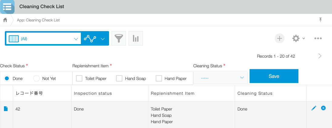
JavaScript and CSS customization
Import the UMD file of Kintone UI Component to the app and upload the JavaScript file with the implementation described below.
See Quick Start for how to upload a file.
Display check list items
Display the check list items labeled as Check Status, Replenishment Item and Cleaning Status on the Record List page of the app.
Notes:
- The Checkbox and Dropdown components display the value of Item.value if Item.label is not specified.
- Set the requiredIcon property to true if you want to display the "required item" icon in each component.
- If you want to set an initial value to the RadioButton or Dropdown component, specify a value for their value property.
- For this customization, specify 'Done' for value of the RadioButton component and '-----' for value of the Dropdown component as their initial values.
kintone.events.on('app.record.index.show', event => {

  // Prevent components duplication bug
  if (
    document.getElementById('kuc_radiobutton') ||
    document.getElementById('kuc_checkbox') ||
    document.getElementById('kuc_dropdown') ||
    document.getElementById('kuc_button')
  ) {
    return event;
  }

  const app = kintone.app.getId();
  const header = kintone.app.getHeaderSpaceElement();

  // Display RadioButton
  const radiobutton = new Kuc.RadioButton({
    id: 'kuc_radiobutton',
    label: 'Check Status',
    items: [
      {
        value: 'Done'
      },
      {
        value: 'Not Yet'
      }
    ],
    value: 'Done',
    requiredIcon: true
  });

  // Display Checkbox
  const checkbox = new Kuc.Checkbox({
    id: 'kuc_checkbox',
    label: 'Replenishment Item',
    items: [
      {
        value: 'Toilet Paper'
      },
      {
        value: 'Hand Soap'
      },
      {
        value: 'Hand Paper'
      }
    ],
    requiredIcon: true
  });

  // Display Dropdown
  const dropdown = new Kuc.Dropdown({
    id: 'kuc_dropdown',
    label: 'Cleaning Status',
    items: [
      {
        value: '-----'
      },
      {
        value: 'Done'
      },
      {
        value: 'Not Yet'
      },
      {
        value: 'Asking Cleaner'
      }
    ],
    value: '-----',
    requiredIcon: true
  });

  // Display Button
  const button = new Kuc.Button({
    id: 'kuc_button',
    text: 'Save',
    type: 'submit'
  });
  header.appendChild(radiobutton);
  header.appendChild(checkbox);
  header.appendChild(dropdown);
  header.appendChild(button);
Adjust the spacing of buttons using CSS
Assign a value to the id property of the Button component and adjust the spacing of the buttons using CSS.
@charset "UTF-8";
#kuc_button {
  margin: 25px 0px 0px 5px;
}
What happens when the Save button is clicked?
You can specify a click event for the Button component.
The required items are checked for whether they have values when the Save button is clicked.
If a value is missing for an item, the component should display an error message.
*The error message should be first initialized with an empty string.
button.addEventListener('click', () => {
  // Reset error messages
  checkbox.error = '';
  dropdown.error = '';

  // Check required itmes
  let erorrFlag = false;

  if (!checkbox.value.length) {
    checkbox.error = 'Please check';
    erorrFlag = true;
  }
  if (dropdown.value === '-----') {
    dropdown.error = 'Please select';
    erorrFlag = true;
  }

  if (erorrFlag) {
    return;
  }
The record should be created after it is verified that the required items have values.
The values of the required items entered on the page can be retrieved using <Component variable name.value>.
For this customization, the value entered in each component is retrieved using radiobutton.value, checkbox.value and dropdown.value.
The Notification component displays a message if the record is successfully created and registered.
// Create request paramerter
const postParam = {
  app,
  record: {
    status: {
      value: radiobutton.value
    },
    item: {
      value: checkbox.value
    },
    cleaning: {
      value: dropdown.value
    }
  }
};

// Register record
kintone
  .api(kintone.api.url('/k/v1/record', true), 'POST', postParam)
  .then(resp => {
    // Display success message
    const success = new Kuc.Notification({
      text: 'Registered check items',
      type: 'success'
    });
    success.open();
  });
Display error message
The Notification component displays an error message when an error occurs during the process.
.catch(error => {
  console.log(error);

  // Display error message
  let errmsg = 'An error occurred.';
  if (error.message) {
    errmsg += ' ' + error.message;
  }
  const alert = new Kuc.Notification({
    text: errmsg
  });
  alert.open();
});
This article was reviewed using Kintone and Google Chrome as of September, 2021.
The version of Kintone UI Component used in this customization is v1.1.0.